Work Eximbanka SR
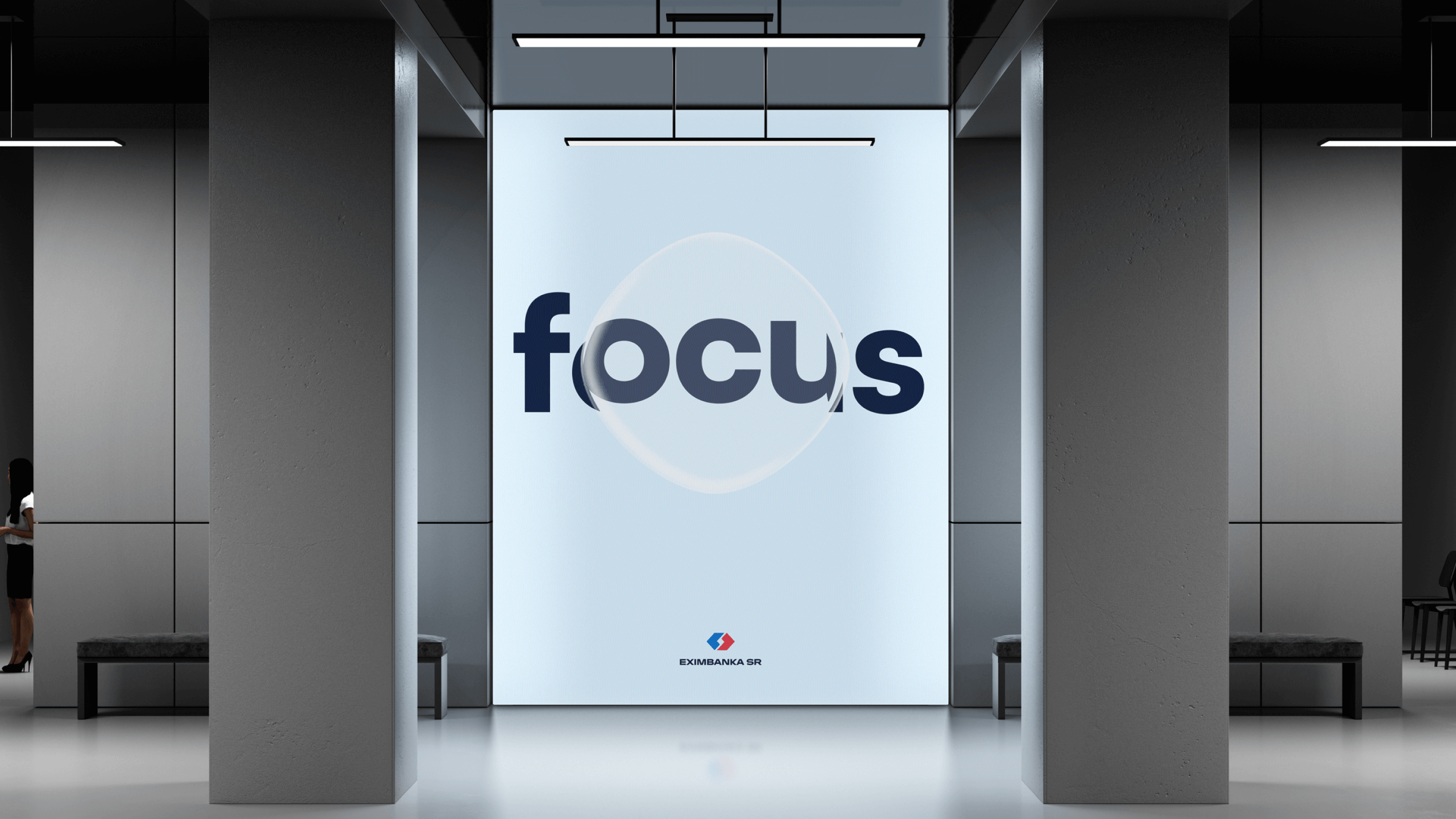
- Motion & Video
- Print Design
- Visual Identity
- Finance
- Public & Culture
- 2024
EXIMBANKA SR is a state agency that supports the export of Slovak companies worldwide. Compared to commercial banks and insurance companies, it also focuses on less-developed and riskier markets. It moves between the private and the public sector, and, as such, needs visual communication that reflects its field of work.
The visual identity redesign had a clear goal from the start – EXIMBANKA SR has to communicate in a modern way compared to other international banks in the country, but also stay relevant and believable to the more conservative clients from heavy industries.
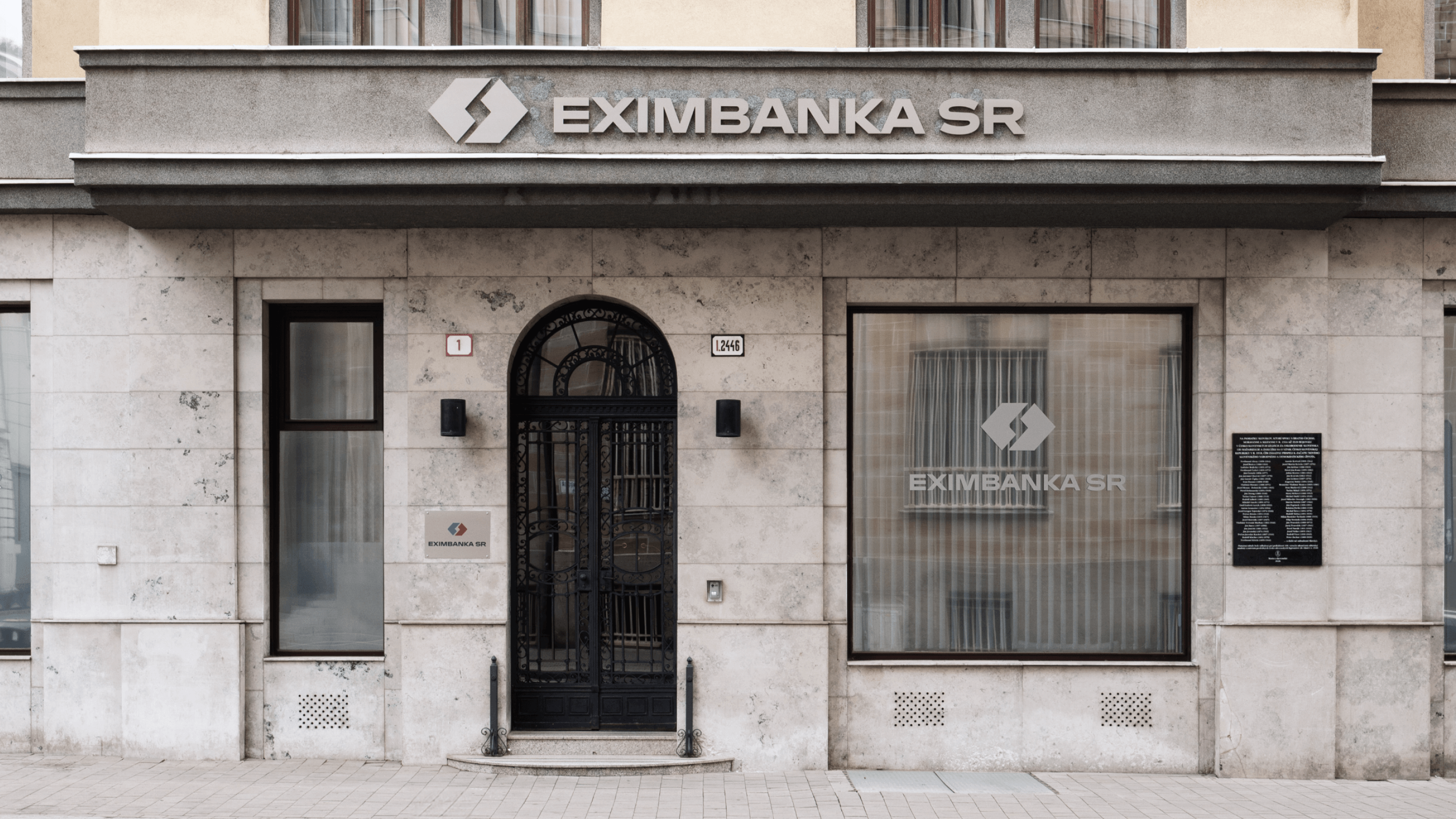
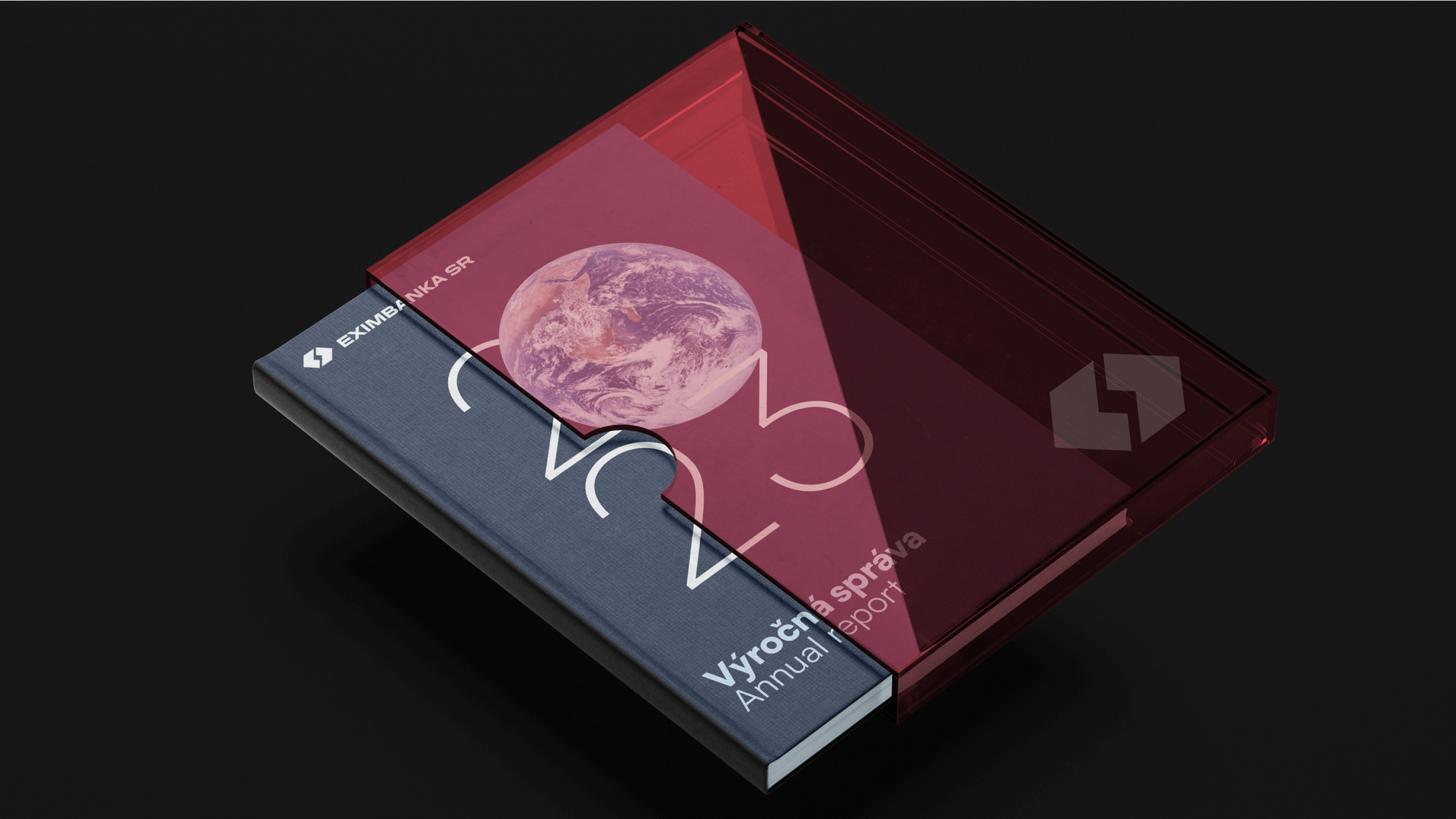
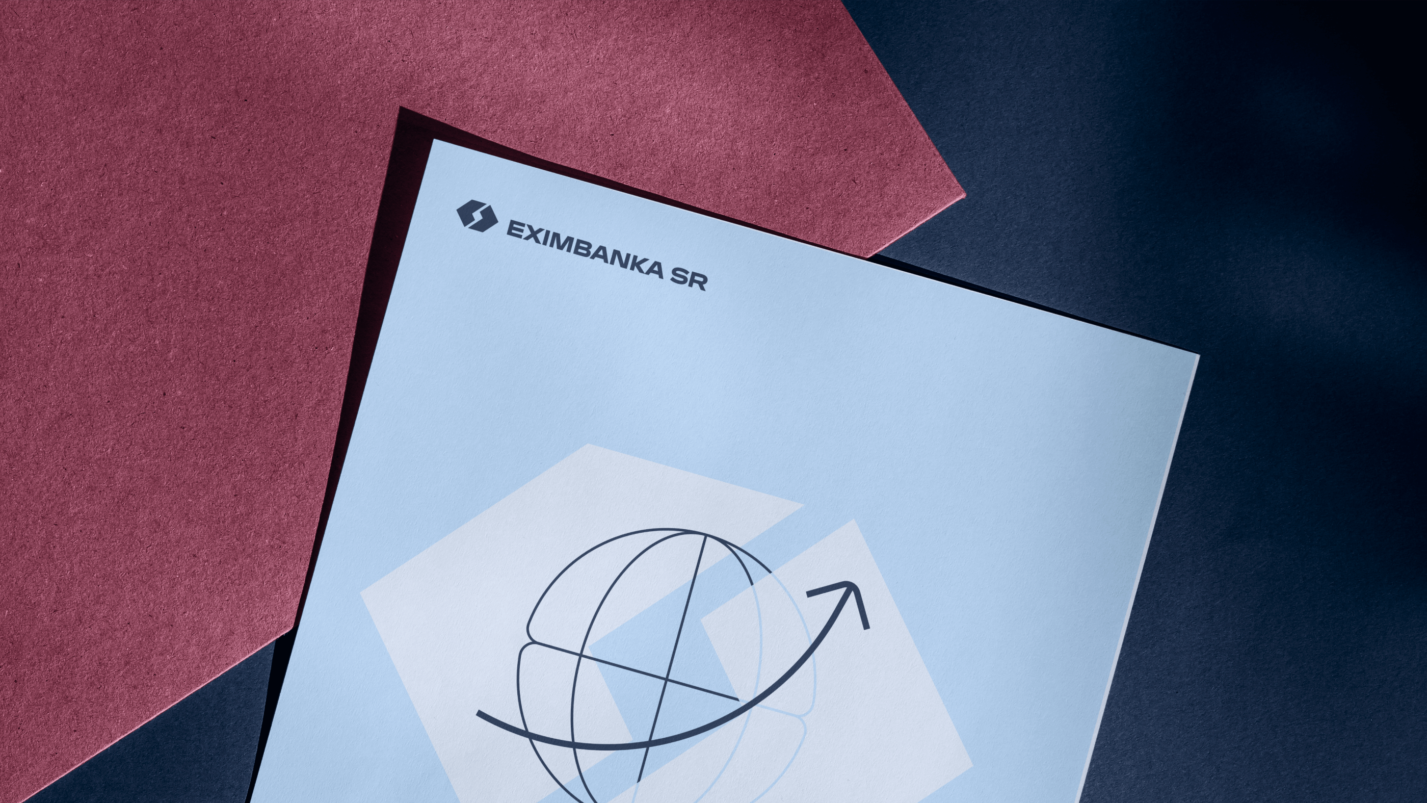
Visual Identity
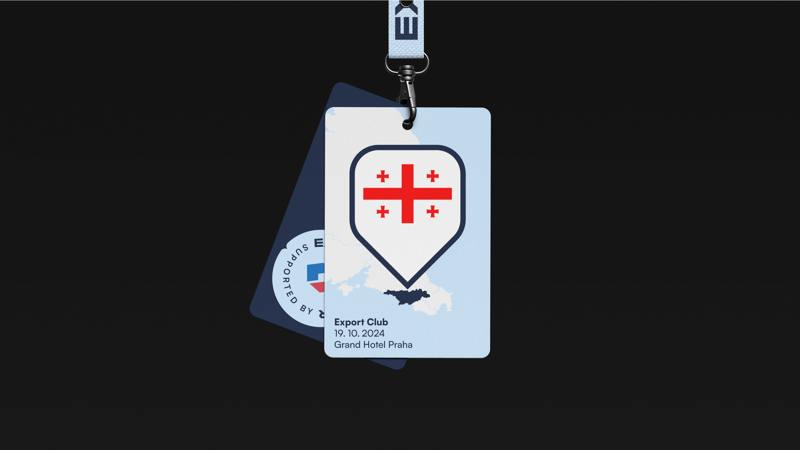
The visual language is built on the symbol of expansion, palette based on Slovak national colours, and illustrated visuals that lighten the identity. This works especially well for internal communication.
The new identity also includes a complex design of all print materials, which have to fit the standards of economic communication. On top of that, it provides formal space branding, specifies the colour-coding of products, and defines the principles of working with motion design.

“It’s a professional presentation of a state institution which, dare I say, has no equivalent in our region.”
Diana Polonyi,
Director of Communication and Public Relations