Work Pannonia Group
- Brandtruth™ Strategy
- Print Design
- Visual Identity
- Finance
- 2023
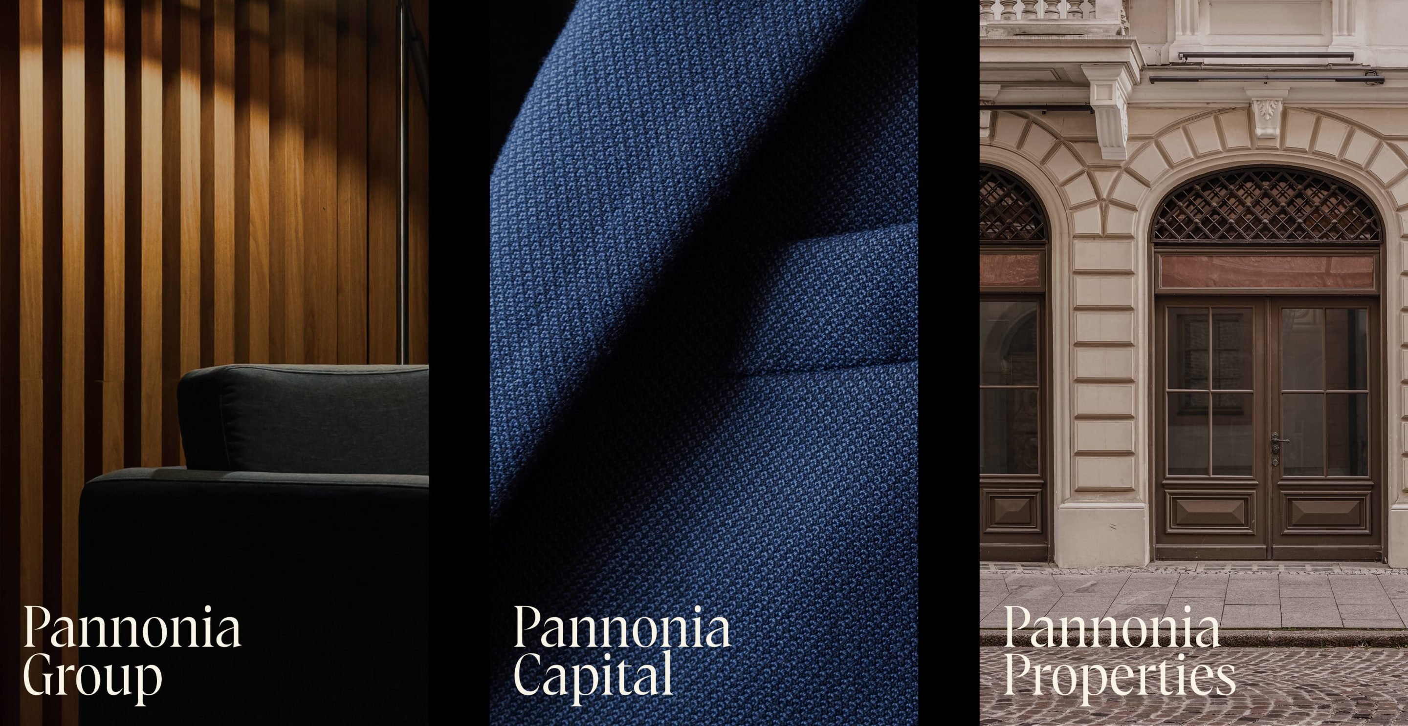
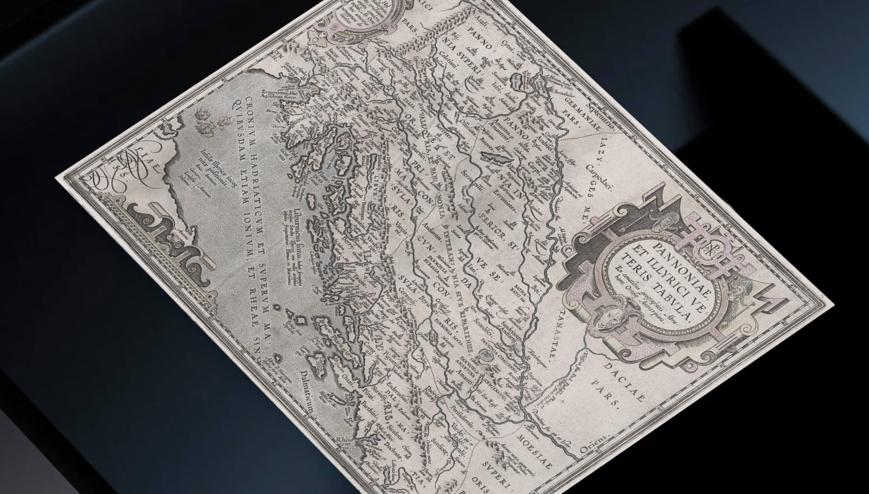
We’ve recently collaborated with a new family asset management firm. Headquartered in a Slovak region that was once part of the Roman province of Pannonia, this became our inspiration for the company’s name.
The firm’s uniqueness lies in its diversified investment strategies and a proven business track record. But in a market awash with options and yet lacking genuine values, we had to face one big challenge. How to create a multi-purpose identity which would work in 3 ways: emphasizing the company’s forward-thinking co-investment approach, signifying potential long-term impact, and also defining the company as a top-tier but accessible choice?
To raise the firm’s prestige while keeping the approachable character, we chose to present the firm as accessible primarily through trusted relationships and personal introductions. This strategy creates a balance between distinction and approachability, and prevents the brand from being seen as trying too hard to impress.
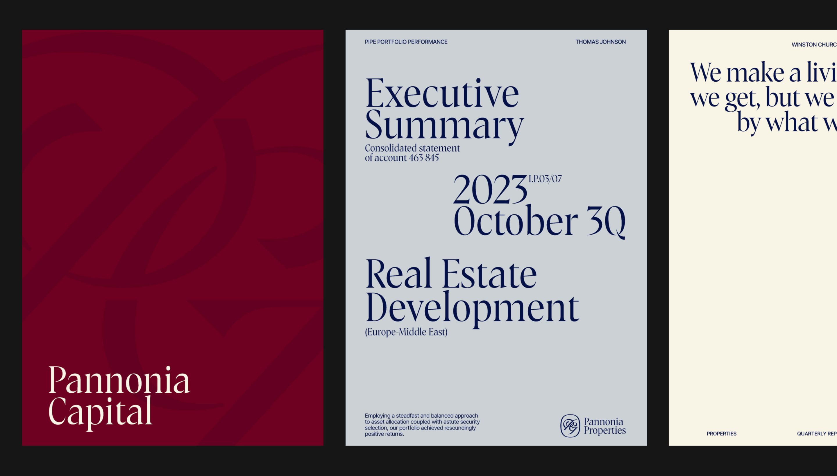
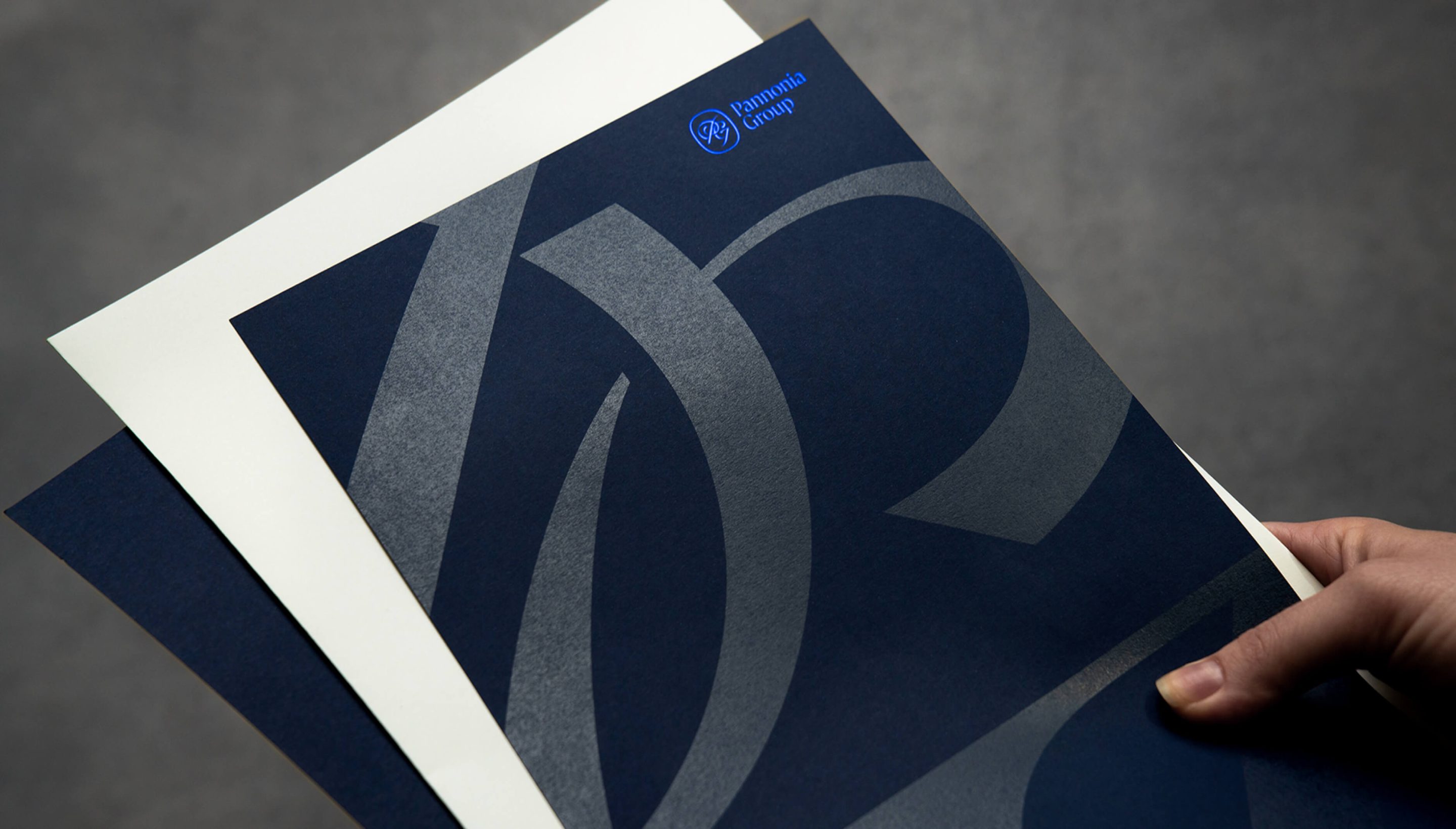
Bespoke
Typeface
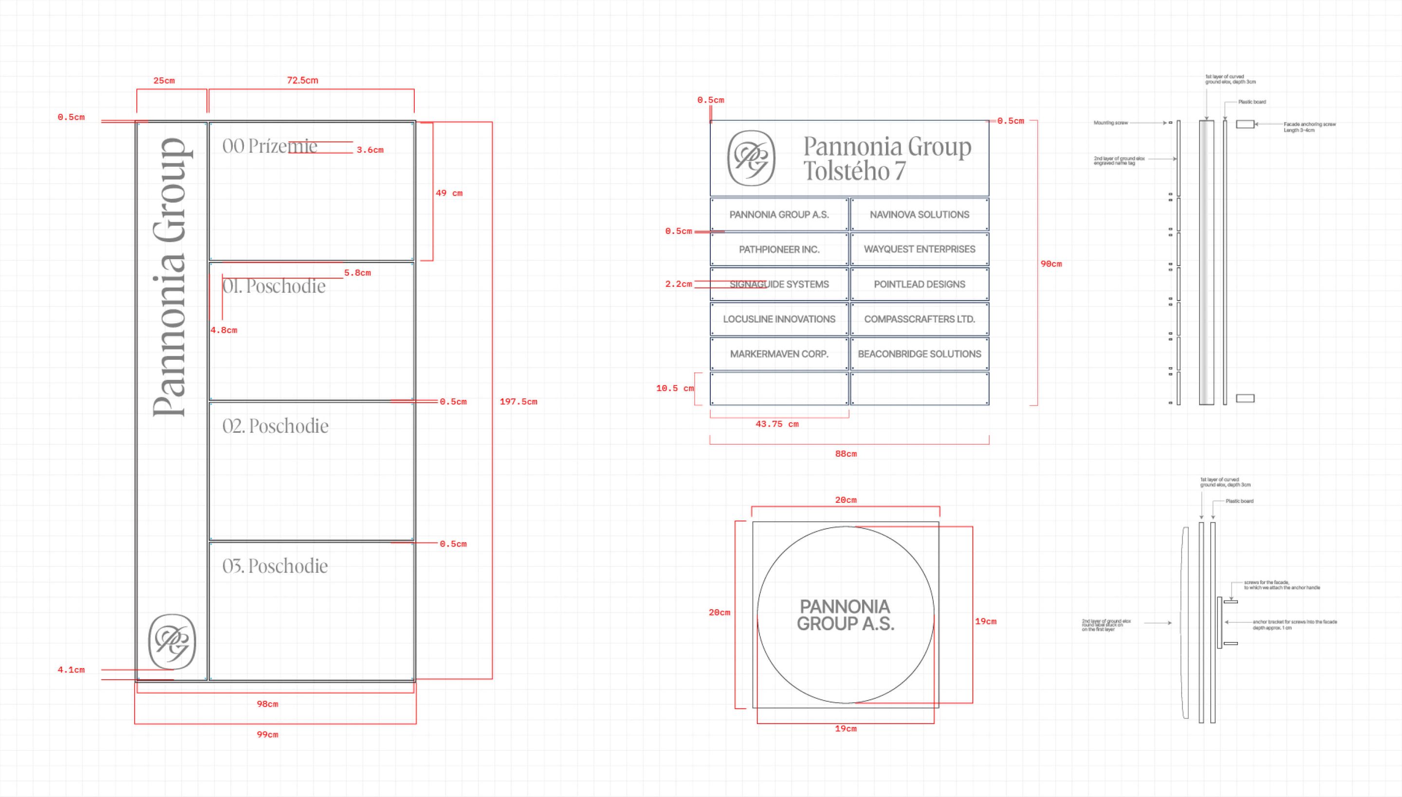
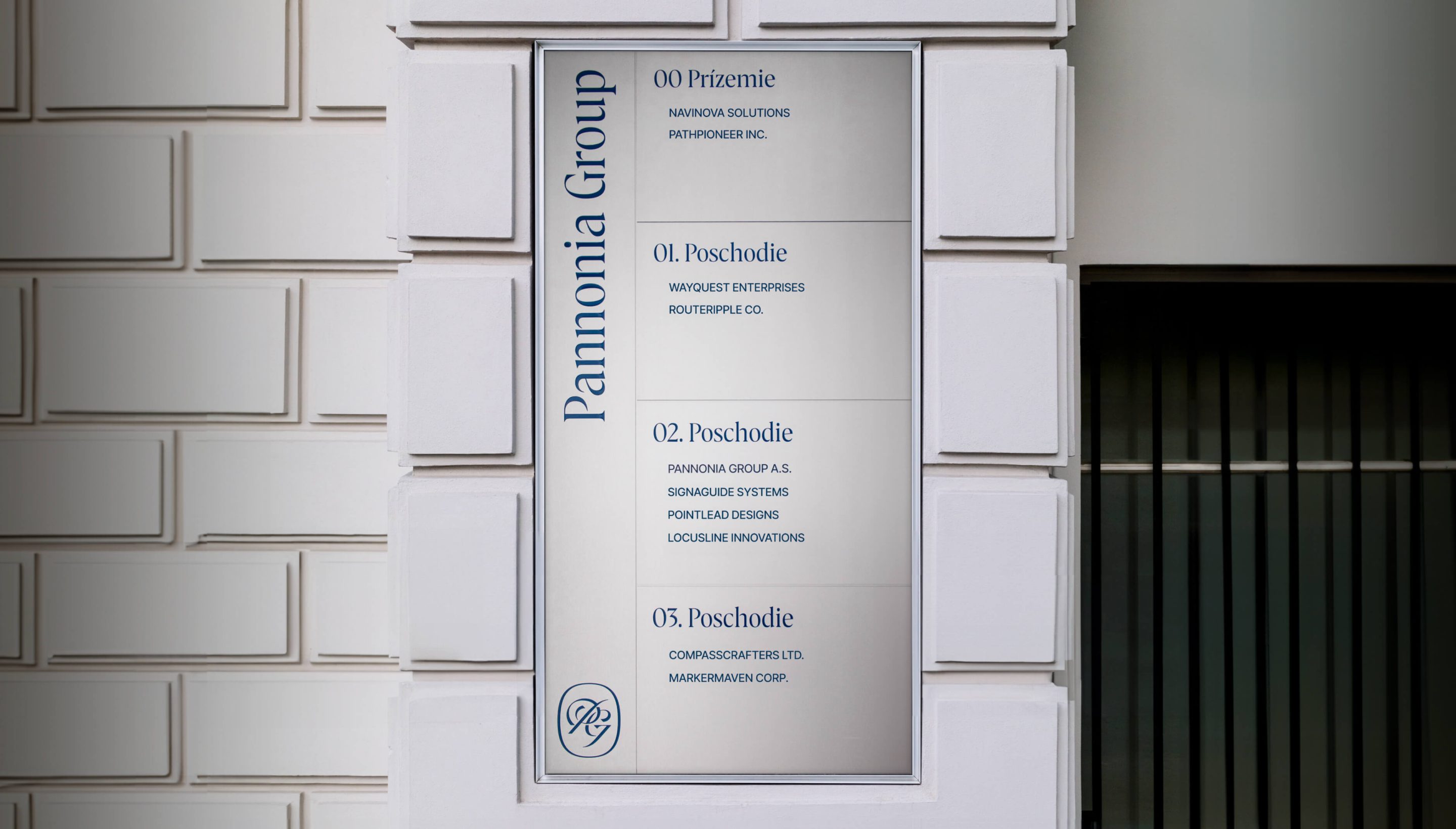
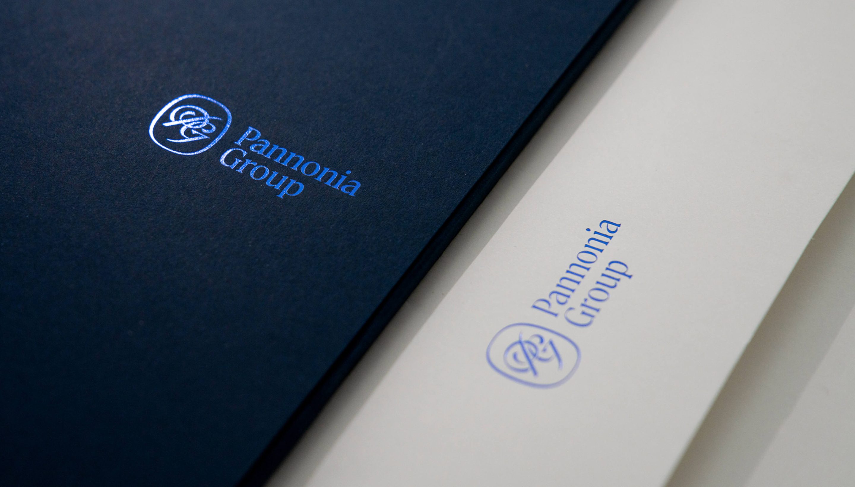
A thoroughly designed monogram, “PG”, stands at the heart of the visual strategy. It acts as a symbol of the firm’s dedicated professionalism and timeless values.
The bespoke typeface, inspired by Roman script, casually complements the monogram. Together, they represent the brand’s main ambition. In fact, every design decision – from the bullet paper to the wayfinding system of the historical buildings in their portfolio – is meant to support this effort: to help the firm build a long-lasting legacy.