Shaping brands from within
The most important story is the one you tell yourself. We use design and strategy to shape your inner narrative into a strong brand and provide ongoing support, helping you reach its potential.
Products
Brandtruth™
Find your unique brand identity, give it a name, and define your strategy with our framework built on
Brand Birth
Brandtruth strategy package, name creation, visual identity design. Ideal for start-ups and new projects.
Brand Library
Digitally available up-to-date brand strategy, with a design manual and the necessary assets, all in one place.
Host & Care
Website updates and backups and prepaid support for minor adjustments.
Selected case studies
Fingera by Innovatrics
Redesign of a brand providing a perfect overview

Holoride
Reshaping tech brand appearance
to impress generation Z
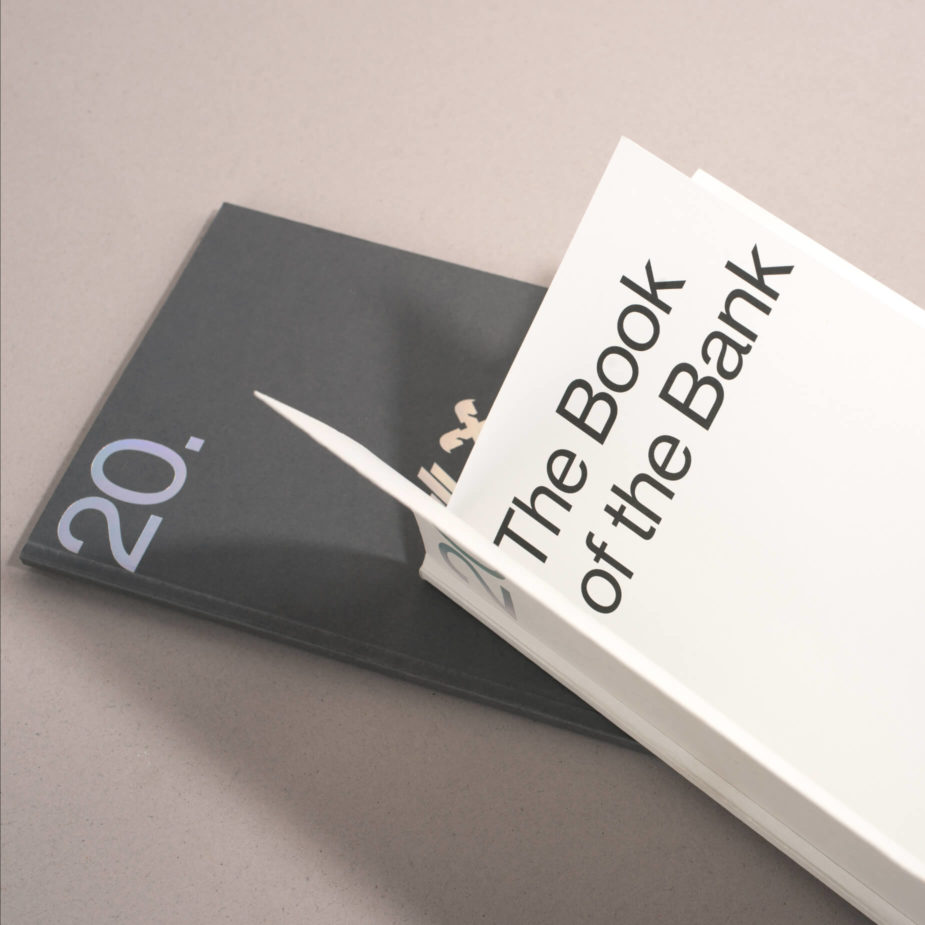
Tatra banka – Strategy 20.25
Refined employer brand & complex
internal communication ecosystem
Pannonia Group
A brand destined to leave a lasting legacy

Brightpick
Setting sights overseas for a European
ecommerce automation company

Lucron
Evolving today's philosophy
into tomorrow's strategy
Bistric
How to exhibit high quality without being posh

Kalas
A new direction for a brand that
dresses the best cyclists in the world

Agáty by Cresco
Growing a new real-estate brand
from a seed to fruit
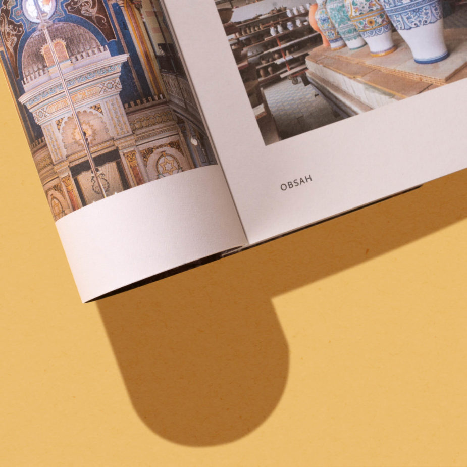
Slovakia Travel
Brochure promoting a country the way
you want to keep it in your bookcase
Denník N – Minúta po minúte
How to completely rebuild a renown
news hub without tearing it down

Agevolt
Revolutionizing the way we think
about electromobility